Cast
A versatile sans-serif typeface designed for clarity and legibility across all media. Cast features a distinctive character with open apertures and balanced proportions, perfect for branding, wayfinding, and user interfaces.
Cast – a Font Family designed by Dominique Kerber
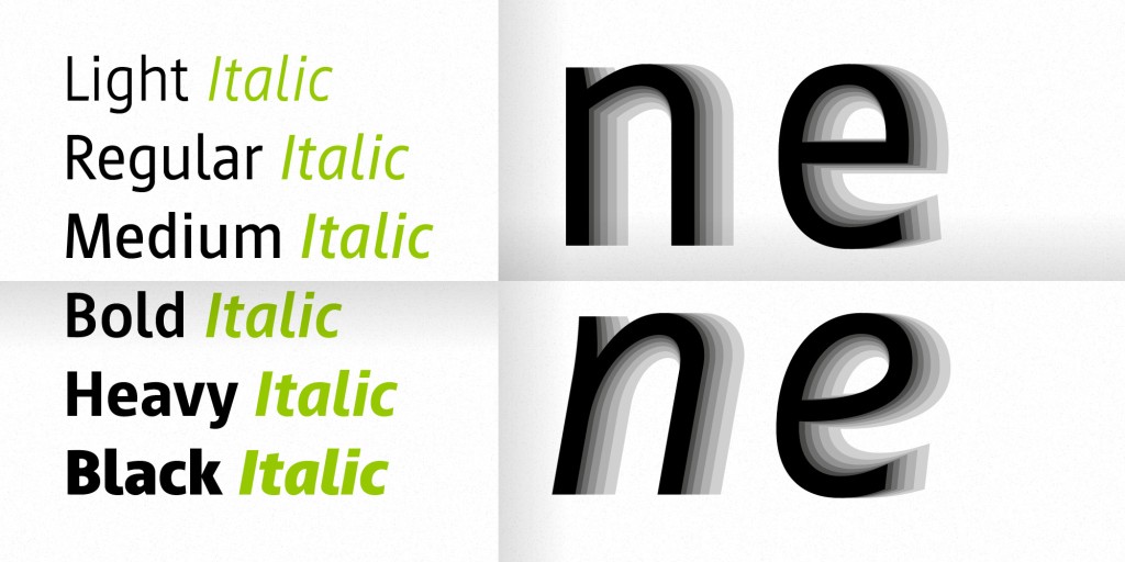
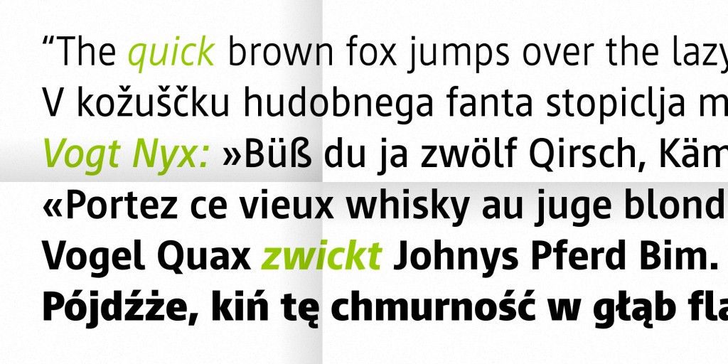
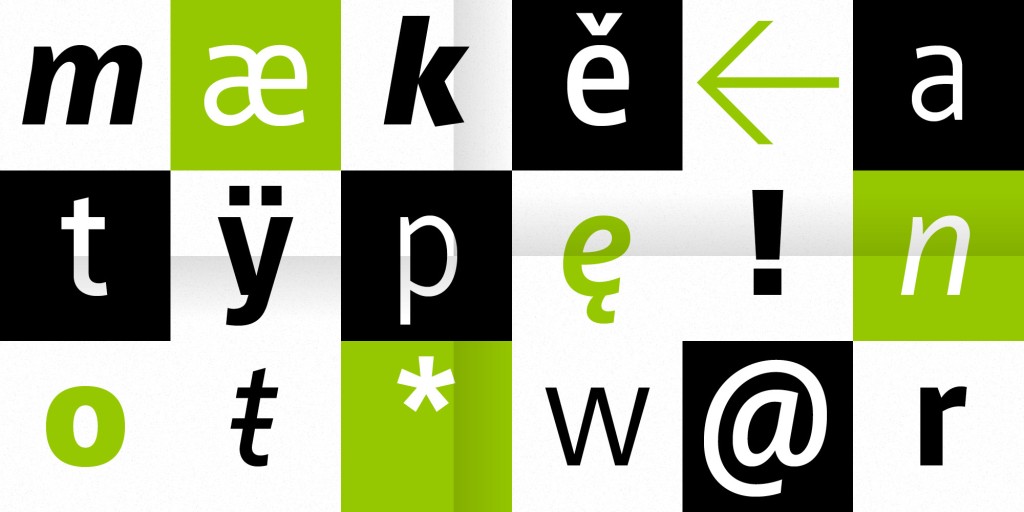
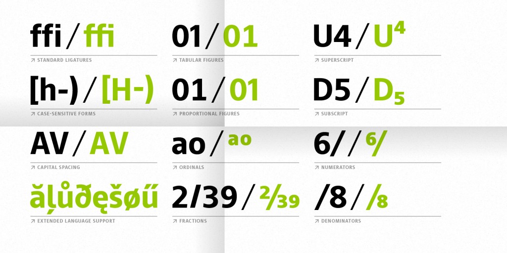
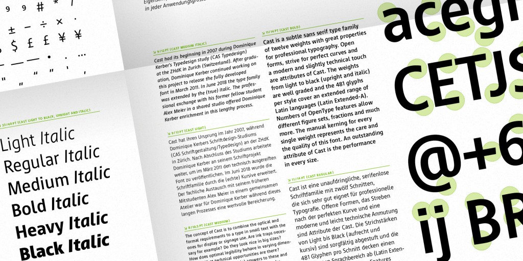
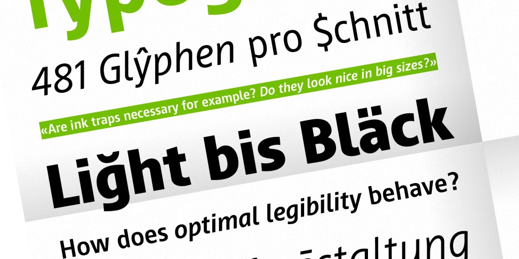
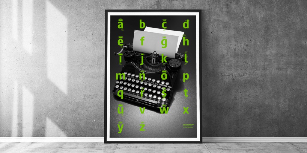
Cast is a subtle sans serif type family of twelve weights with great properties for professional typography. Open forms, strive for perfect curves and a modern and slightly technical touch are attributes of Cast. The weights from light to black (upright and italic) are well graded and the 481 glyphs per style cover an extended range of Latin languages (Latin Extended-A). Numbers of OpenType features allow different figure sets, fractions and much more. The manual kerning for every single weight represents the care and the quality of this font. An outstanding attribute of Cast is the performance in every size.
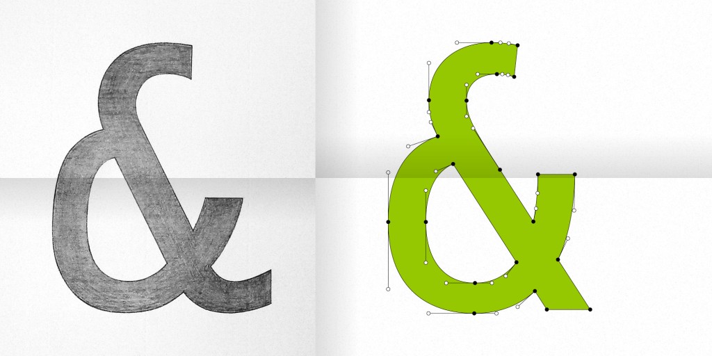
Cast had its beginning in 2007 during Dominique Kerber’s Typedesign study (CAS Typedesign) at the ZHdK in Zurich (Switzerland). After graduation, Dominique Kerber continued working on this project to release the fully developed font in March 2011. In June 2018 the type family was extended by the (true) italic. The professional exchange with his former fellow student Alex Meier in a shared studio offered Dominique Kerber enrichment in this lengthy process.
The concept of Cast is to combine the optical and formal requirements to a type in small text with the ones for display or signage use. Are ink traps necessary for example? Do they look nice in big sizes? How does optimal legibility behave in varying dimensions? What technical opportunities are there? Cast gives its own (possible) answers to these and hopefully some other questions in typography.
Ausnahmsweise Overcompensation
Darkness Searching Newfoundland
Synchronized Sol Dehumanisation
Specialmente Effekte Undeceived
Städte Trenchermen Dynamiittia
Syndicating Instrumentalmusik