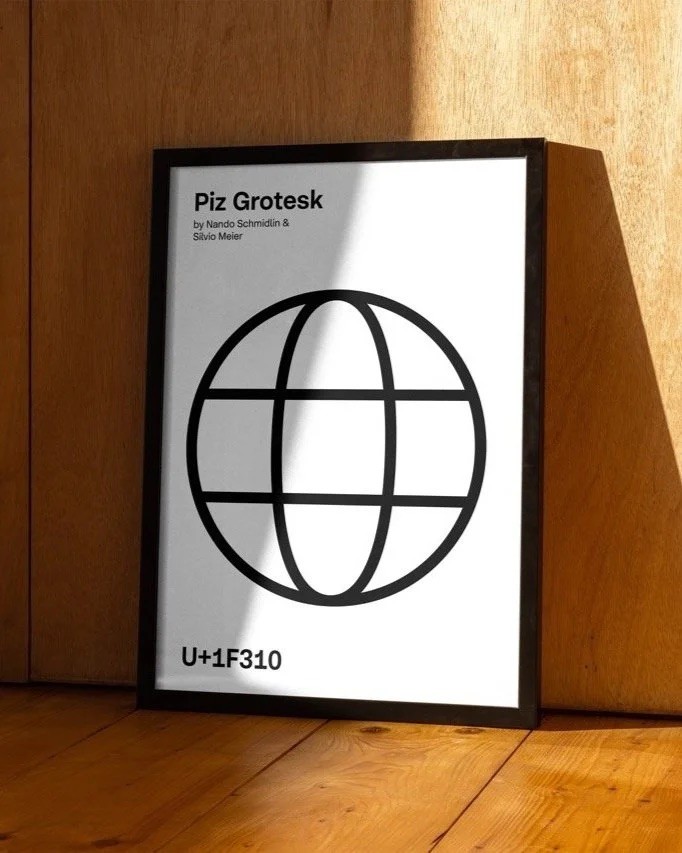
Piz Grotesk
Piz Grotesk is a modern reinterpretation of mid-century Swiss typography, inspired by the sharp beauty of glaciers. It blends technical precision with a unique character and is optimized for readability and complex technical work.
Smooth
Rounded and curved segments give a friendly and human touch
Precise
Rectangular terminals maintain a neutral and technical tone
Distinctive
Deep ink-traps to improve legibility and give additional character
When we set out to create a new static grotesk for the Serpentype foundry, we knew we had to put on proper hiking boots. Mid-century Swiss typography has always been a huge inspiration for us. We wanted to honor that legacy, but we also wanted to give it a twist that feels uniquely ours, with the latest technical innovations built in.
We drew a parallel with glaciers, imagining the sharp peaks merging with the sweeping curves of a glacier’s tongue. The inktraps, reminiscent of crevasses, add a level of detail with a memorable character. We made sure it reads beautifully, with a generous x-height and balanced proportions.
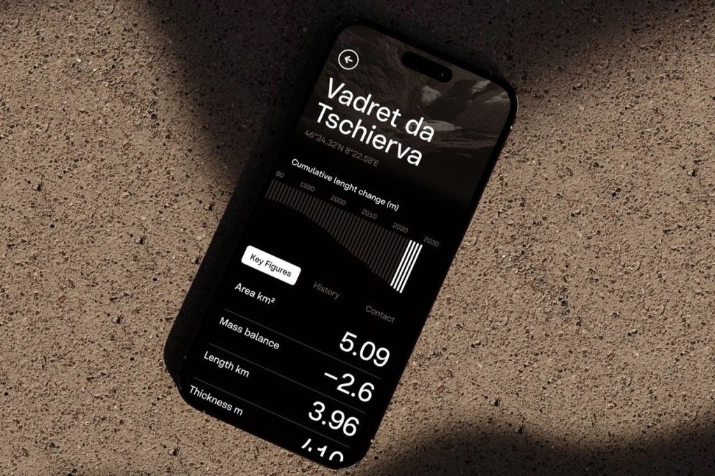
But we didn’t stop there. Glaciers aren’t just beautiful — they hold layers of history and scientific significance. That led us to focus on Piz Grotesk’s technical functionality. We extended its mathematical character set, included uni-width numerals, and optimized the subscript and superscript characters. If you’re using it for reports, diagrams, or dense technical documents, it’s going to feel like walking on clouds.
Piz Grotesk is our tribute to Swiss typography with its own personality — versatile, precise, and perfect for any project where clarity is key.
Materialising Complementation
Discountenances Revivification
Gapes Outperformed Enceinte
Uncontrovertible Churchgoing
Uncompromisingly Bandoliers
Accomplished Whoremasters
Underexposures Dictatorship
Ashland Poe Recommending
Underload Superabundance
Piz Grotesk emerged from the creative synergy of two Swiss designers: us, Silvio Meier and Nando Schmidlin. After years of dedication and fine-tuning, we’re thrilled to finally unveil the finished typeface family. Designing Piz Grotesk gave us the opportunity to take our passion for aestethics to the highest level of perfection, using every skill we’ve acquired over the years in graphic and product design.
Thanks to everyone who supported us conquering the Piz!
Sabina Kipară
Font Production
Dominique Kerber
Expert review
Marlon Ilg
Expert review
Moritz Kleinsorge
Quality Assurance
Sebastian Carewe
Kerning and Quality Assurance